Thirty's 3 is a skincare shopping experience that’s as glow-worthy as the products it sells. This e-commerce platform is all about clean, thoughtful design—starting with a landing page that pulls you in, a products page that makes browsing through the products available, a product details page that spills all the details of whatever product you might be interested in; shows prices, ratings and the reviews, and an About Us page that ties it all together, where every details of the company is available for you to read through. Built with care, it’s a space that feels personal and easy to explore, inviting anyone who’s curious about great skincare to dive in and see what’s on offer
The Landing page
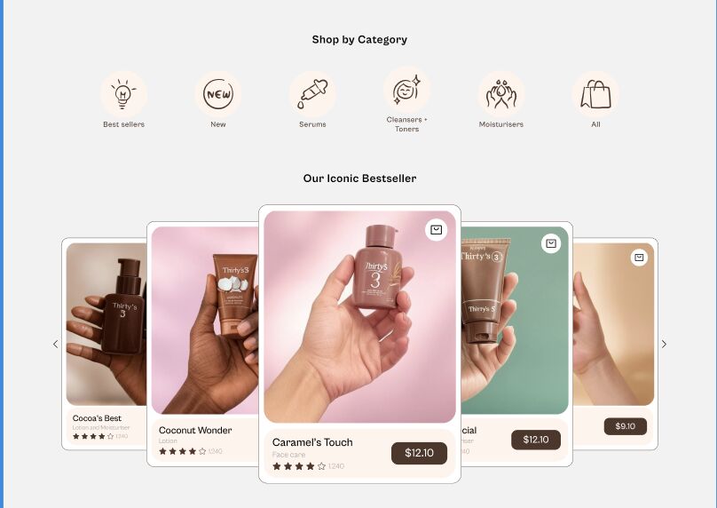
The landing page for Thirty’s 3 sets the tone for a skincare journey that’s both inviting and easy to dive into. The hero section grabs you right away with a unique layout—stacking bold text like "Elevate your self-care ritual" alongside a sleek product shot of Caramel’s Touch, framed in a way that feels fresh and modern. I played with clean lines and a warm, earthy palette to make the product pop while keeping the vibe soft and approachable. Below that, a shop-by-category section lets users jump into what they’re after—whether it’s new arrivals, best sellers, or serums—with products laid out clearly for quick browsing. I also tucked in key info sections to share what matters, like ingredients and brand values, so users feel in the know without being overwhelmed. It’s a page that’s all about drawing you in and making exploration feel effortless.
The Product page
The products page for Thirty’s 3 is where the skincare magic comes to life. Right at the top, a clear heading welcomes you, paired with a handy filter system to help you zero in on exactly what you’re after—whether it’s a serum, moisturizer, or something else. Below that, you’ll find a lineup of products with their prices, some standing solo, others bundled as sets, all laid out so you can browse without any hassle. There’s also a deal section that catches the eye, offering curated sets at a discounted price—like a little nudge to treat yourself while saving some cash. Inspired by the warm, earthy tones from the landing page, this page keeps the vibe consistent, making it easy and tempting to explore the full range of goodies.
The Product Details page
The product details page for Thirty’s 3 puts the spotlight on each skincare gem with a sleek slideshow of three images, showing the product from every angle. Next to that, you’ll see the price and size options, making it easy to pick what works for you. Below, ratings from other customers give a quick sense of how it’s loved, while their comments add real, honest thoughts—helping you feel confident about your choice. The page keeps the warm, inviting feel of the site, blending clear info with a personal touch.
The About Us page
The About Us page for Thirty’s 3 brings the brand’s heart to the forefront with a simple, heartfelt layout. First, a collage of pictures from happy customers using the products sets a warm, community vibe. Then, a clear story of who we are unfolds, followed by the brand’s purpose—both short and straight to the point, so you get the essence without any fluff. Wrapping it up is a personal letter from the founder, adding a genuine touch that makes you feel connected to the journey. It’s a page that’s all about building trust and keeping things real.
Role and Skills
I handled everything from sketching the first ideas to polishing the final layouts. I leaned hard into the user-friendly design—making sure every click feels smooth—while playing with colours and fonts that scream skincare vibes. I used Figma to design the User Interface and I used Framer to bring these designs to life.
Challenges and Solutions
One challenge I ran into while designing the landing page for Thirty’s 3 was making sure it worked for everyone, following Web Content Accessibility Guidelines (WCAG). I noticed the light peach element (#FFF4EC) I used was blending into the grey background (#F2F2F2), making it hard to see. To fix this, I swapped in our rich brown primary color (#4E3629), which boosted the contrast and made everything pop. This tweak not only made the page easier to navigate for all users but also kept the brand’s warm vibe intact—proof that thoughtful design includes everyone. The link to the full story is below.
Full story
The design that was against the guidelines (challenge)

The design that is in accordance to the guidelines (the solutions)
Conclusion
This design is a well-detailed and designed E-commerce platform that highlights all the important areas of User experience and also makes sure the products are out for the users to enjoy.